5 Down-to-Earth Concepts From Data Geniuses
Lagniappe* is a series on the Camelback Blog through which team members share curated lists of thought-provoking content related to our mission.
Nice to meet you blog reader; I’m the Director of Strategy and Insights for Camelback. If you’re unsure what I do from that title, it’s that my job is to ask questions. Usually, these are difficult questions that challenge our team, Fellows, and facilitators to take a hard look at their work and find opportunities for improvement. One way that we can find the transformative (and answers) is through data. I know data can sometimes feel intimidating, so for my lagniappe post, I want to take you on a journey with some of the brilliant individuals who have helped shape the way I think about data. These concepts, I believe, will help you think how your own work can be informed by data (and the folks that I refer to as data geniuses), whether you work independently, for a startup, or a larger organization. With these tools, there’s no reason we can’t tackle national educational inequities. (More on this in my conclusion.)
1. Make data easy to digest
I know that I am guilty of being the friend that tells you the never ending story at the last housewarming party you attended. I can’t help it; I really enjoyed my last vacation. In my goal of being a better friend to you, I will try to come back to the words of Henry David Thoreau as it pertains to data, “simplify, simplify.”
The book that instilled this sentiment was Informational Dashboard Design. While the book may be a tad bit dry at points, the revelations in it are not. Stephen Few, the author and an innovator in business intelligence, hammers home the sentiment that if we remove the things that don’t add to our story, we are much more effective storytellers.
What does that look like in your daily data life? One notable example is when you show a graphic representation of your data (like a bar graph on a Powerpoint slide), you should have a higher ratio of ink used for the data itself compared to the total ink used to print your graphic (regardless of whether or not you’re actually printing out that slide). This concept means that you would remove the border around your graph and remove colors if they don’t tell you anything about the data -- only “ink” that serves the communication of the data itself should be included. Look at your graphic and ask yourself the question, does this component add to the story I am creating with data? If it doesn’t, cut it.
What are you left with? An easy and quickly digestible way to share your data with a funder, your board, or your grandma.
> Read The Common Pitfalls of Dashboard Design, a whitepaper by Stephen’s organization, which does a great job simplifying the insight you can derive from Stephen’s book.
2. Transform numbers into action
I love numbers. That’s the honest truth, but that doesn’t mean I love all numbers. Tell me if you’ve heard this before: “The current ratio has increased by five percent to 1.23 from the prior reporting period, indicating increased liquidity …” and so on and so forth. I’m guessing you’ve probably thought, “Tell me why I care about this,” because I definitely have.
Avinash Kaushik refers to stories like that as “data puke.” While most of his examples live firmly in the digital analytic space (he is the digital marketing evangelist at Google), they can be applied firmly to any analytic space. What I appreciate most about his writing is that he doesn’t pull punches when it comes to shining a light on the things that we do in organizations that we should stop doing, especially situations that make us wonder why we’re supposed to pay attention in the first place.
I only want to know about “changes in the current ratio by five percent” if it allows me to take action toward the objectives of my organization. Your accountant should be looking at the current ratio for about two seconds each month. If changes in current assets and current liabilities change, they’ll notify you (hopefully). The measures that truly allow you to take action are more purposeful and more related to the questions that you have about your organization.
Now is the time to bring up an acronym that I don’t like, but that I begrudgingly accept as useful: KPI. Key Performance Indicators are measures that help you to gauge how you are doing against your objectives. If you are a startup, that might generally fall in the realm of increasing awareness about what you do. Who do you want to increase your awareness with? If it’s visitors to your website, which visitors do you really want? How can you measure that they are visiting your website and furthermore doing the things that you want them to do on your website? (Told you I asked questions.) This is all to say that numbers should serve your need, and not the other way around.
> Read: “A Big Data Imperative: Driving Big Action” on Avinash’s blog, Occam’s Razor, a cornucopia of digital analytics knowledge

3. Dig below the surface to unearth data gems
I’m going to bring you back to the largest, most recent example of a situation where we followed data as our guide to an unforeseen future: the polling for the 2016 presidential race. How could all of the predictive election tools get it so wrong?
During the grueling year of election shenanigans, I followed Nate Silver’s blog FiveThirtyEight with fervor. The founder of FiveThirtyEight, Nate Silver, rose to prominence from his uncanny accuracy predicting the state outcomes of the presidential elections in 2008 and in 2012. His analyses were counted on as a predictive election tool that, even right before the election, showed Trump with a 29% chance of winning.
There is always uncertainty with data, especially when viewing it in the aggregate. In January, before the inauguration, Nate Silver wrote a detailed summary on the real story of the 2016 election. Whether or not hubris is weaved through his account, the important point to take away is that the actionable indicators that pointed to a Clinton upset were there in the data.
What does this mean for your organization? If you are measuring satisfaction of your product or services and you have great results, dig a little deeper by segmenting your data. You may be surprised by what you unearth (even if you’d rather leave it buried).
> Read: “Excellent Analytics Tips #2: Segment Absolutely Everything” on Avinash’s blog
4. Shared data can be powerful, but don’t forget to be inclusive (take lessons from Collective Impact)
Sometimes I feel that the problems the social impact sector is trying to solve are too big, too insurmountable, and too baked into systems that perpetuate inequity. Actually, let’s be honest -- I feel like that most of the time. One idea that is looking to overcome this problem is termed “collective impact.”
FSG, a social impact consulting firm, furthered the idea of Collective Impact in an article in the Stanford Social Innovation Review by creating a framework with five elements: a common agenda, shared measurement systems, mutually reinforcing activities, continuous communication, and a backbone support organization.
This framework has taken off and is being adopted across the US. As generally happens with the implementation of a new idea, many shortcomings are being unearthed. One voice in the fray is Vu Le, Executive Director of Rainier Valley Corps (a Seattle-based social justice org). Vu’s writing hit home how critical it is to ensure that communities of color are centered in the room when building shared measurement systems. Small community and direct service organizations have generally been left behind in Collective Impact. Measurement can be used for good, and it can be used for not-so-good.
I think there are two important takeaways here: 1) Are you working with other organizations in your space to help solve the seemingly intractable systemic problems that lead to inequity? 2) Center communities of color in conversations you have about building shared measurement systems (as well as with all of your other activities).
> Read: “Why Communities of Color are Getting Frustrated With Collective Impact” on Vu Le’s blog
5. The transparency and accessibility of data is powerful
Last on this list is the power that access to data can have for problem solving. One of the more notable advocates for Open Data is Tim O’Reilly, tech innovator and software pioneer, who believes that Open Data is a critical tool for business and government. There is currently an international statute called Open Data 4.0, which basically ensures a simple, standardized way of sharing and using data.
Some of the marvels that have come out of the Open Data movement have been: improved transparency around financial advisers, better access to real time transportation data, mapping out more accurate political districts, and emergency response to name a few. When set up intentionally, open data allows for governments to obtain feedback that improves their data collection and furthermore meets the needs and wants of its citizenry.
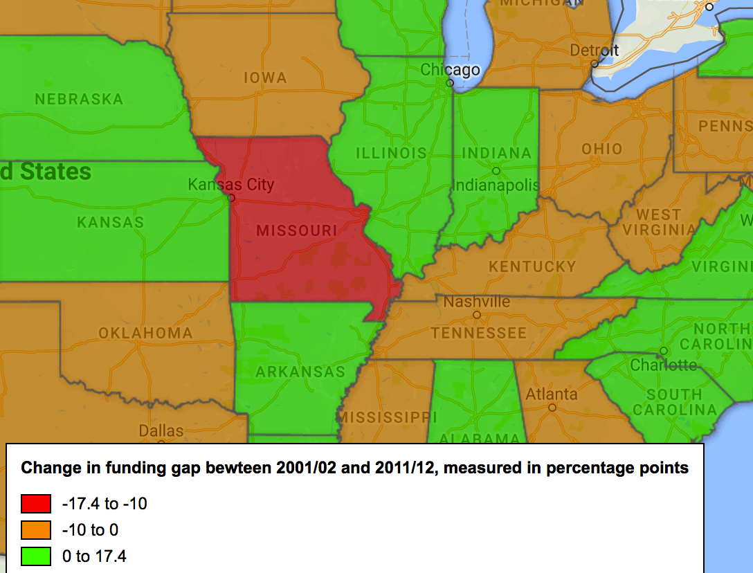
However, the power of open data comes with a catch. Opening up data can be painful. Imagine if we had access to the budgets of all the public schools in our school district. That would be a difficult pill that the school district would have to swallow when citizens ask about why an affluent school has a budget per student of $1,500 more than the poorest schools in the district.*
Swallowing that pill might be just what we need to see governments improve their responsiveness to their constituents.
Now I’ll leave you with a radical thought. In the age of Open Data, there is an opportunity to shoot even higher. If transparency is good for governments and business, shouldn’t it be good for nonprofits too? That is something I’m trying to be more intentional about with my work at Camelback -- a consideration of what Open Data 4.5 could look like.
> Read: “Opening Up Open Data: An Interview with Tim O’Reilly” from McKinsey
> *Bonus read: “The gap between rich and poor schools grew 44% over a decade” from The Hechinger Report (complete with interactive maps) by Jill Barshay
In Conclusion: Why Data Matters
Camelback’s mission of changing education for the better is a systemic process. The systems that we work in are broken down into organizations, and organizations are broken down into individuals. Ending inequity in education is an achievable thing. The US has more than enough ability to end the cycle of inequity, but this includes the whole gamut of fixing governmental systems and of providing equitable solutions that lead to our end objective of equity in education.
I believe that one small component (the measurement world in which I live) can help us to move a little bit further by learning from smart people. Some small steps that we can look at in our organizations are to couch our measurement in the systems we want to impact, make our data more transparent, and not hinder our organizations by using measurement as a tool to provide easily digestible data that helps us to take action towards the objectives our organizations.
If you’d like to add to this conversation about what we can learn from smart people in data, please feel free to reach out.
Jon is Camelback's Director of Strategy & Insights.
*“Lagniappe” has come to mean “a little something extra after a transaction,” and is a word historically derived from the language melting pot of 1800s New Orleans. Mark Twain wrote in Life on the Mississippi (1883), “We picked up one excellent word, a word worth traveling to New Orleans to get; a nice limber, expressive, handy word-'lagniappe'.... It is Spanish-so they said."
FURTHER READING:
Lagniappe: 5 Ladies Who Told Amazing Stories in October
Lagniappe: 5 Immigrant & Refugee Entrepreneurs Doing Really Cool Things